While we’re deep in the thick of WordPress 7.0 with beta 2 coming out this week, I spent some time today taking a step back and revisiting some work I had hoped to land for 7.0 but didn’t make the cut. This punting happens and it happened for good reason in this case. In the spirit of working in public and in an effort to start to pull together some of what’s being done, I figured I’d do a quick post sharing what’s underway. These are all purposefully contained features to consider and have some open questions. They are all done with Claude code as part of my “Learn AI deeply” efforts. If all of what’s shared below shipped (hide notes + filtering + compact notes), here’s what the experience would be like so we can get a fuller sense of how the pieces fit:
Show/hide notes on the canvas (PR 76024)
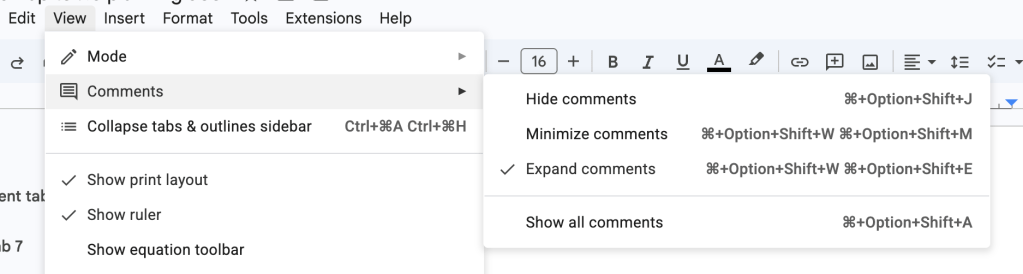
My biggest concern here is how this ever so slightly changes the flow and adds some friction. In Google Docs, it behaves differently where you consistently have the Comments Icon you can select that opens up the dedicated Comments sidebar. Outside of that, you have View > Comments settings where you can switch between hiding notes, seeing expanded versions, or minimized versions. This would make it harder to access the full Notes sidebar by adding one additional click (Select Notes icon > Select “Show all notes”) compared to a one click option with Google docs. Tied to this, let’s say you’ve hidden notes and you want to see them again, you then have to select the Notes icon > Show all Notes > close sidebar. I expect some iteration here. On the flip side, I think this does add clarity to what one is looking at when they open the Notes sidebar. As is, it’s hard to know how the sidebar is different than what you see on the canvas.
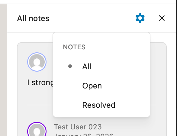
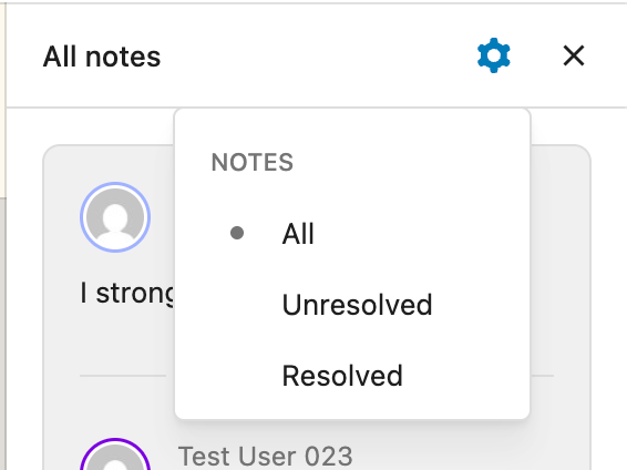
Filter options in Notes panel (PR 75982)
I started out using what was shared here from data views but it felt a bit bulky so I switched to a radio menu based on feedback from a designer. Thinking longer term though, like filtering by Author, it might make sense to use the data view approach. I also ended up removing the density options although I could see an argument for adding a more condensed version in this sidebar as it can get unwieldily with long note threads.
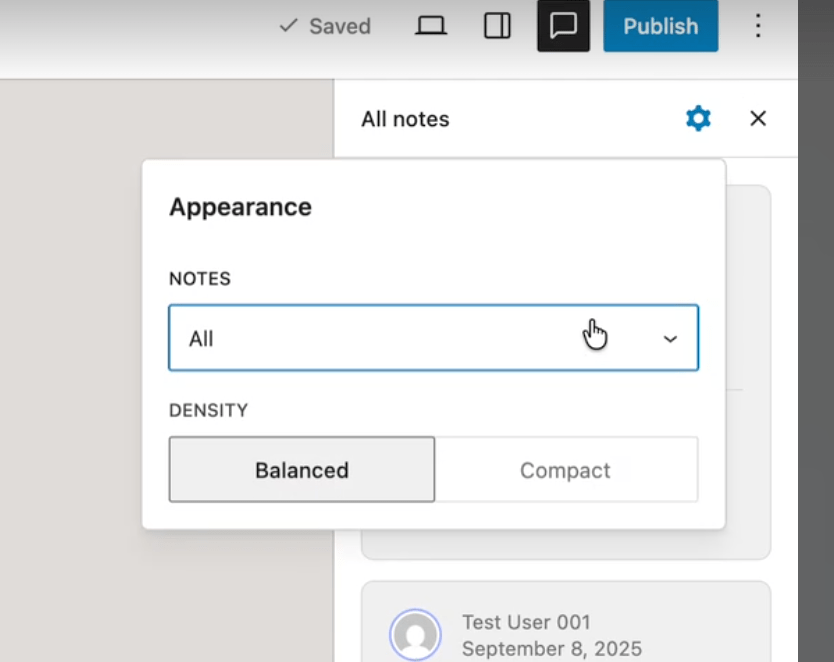
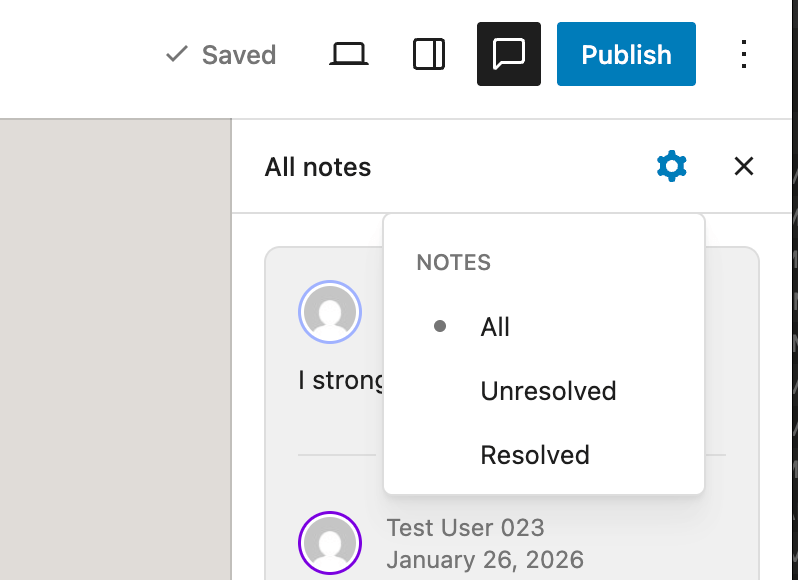
Details matter and I’m torn on this one: Should the filter by Unresolved and Resolved or Open and Resolved? Here’s what each looks like side by side. I lean towards Open rather than Unresolved as it feels clearer and simpler.
Add compact notes optionality (PR 74985)
This was the original PR that I wanted to have added for 7.0 that couldn’t quite make it. There are a few questions that remain with a key one being around whether the current state has value or if we should wait until a resizable sidebar can be implemented. Here’s what’s on my mind:
- Should we only do a resizable sidebar? If not, where should we put the option to control this setting to expand and minimize notes?
- What can be refined, design wise?
A resizable sidebar would require more technical work than I can likely do since the width of the sidebar is hard-coded and there’s not a private API to change it. Because it’s always helpful to look for inspiration, Google docs currently offers these options for comparison:
I personally find a lot of value in being able to minimize without a resizable sidebar interaction because the Notes take up a fair amount of space as is and it’s nice to have an option to limit what’s in view.
Tied to this, I find the current experience confusing since it’s not quite clear what to expect from clicking on the Notes icon and this adds good friction to better explain what opening the dedicated Notes sidebar does, even if it does require an extra click. I do think it adds clarity in return.
Feedback welcomed, here or on the PRs. Whether any of these land or not, they have been absolutely awesome to work on.

Leave a comment