Since I’m no longer running the FSE Outreach Program and it’s moving to better days in a new evolution, I sometimes find myself with swirling thoughts and no solid avenue to share. A post on Make Core would be too serious yet keeping it to myself feels unhelpful. All of this is to say, here are some “on my mind” style thoughts as we get deeper into site editing and begin to enter phase 3 mainly in the form of some overlapping problems to address. Each will need their own solutions to match their nuances, but I’m sharing to advocate for us to think about these problems as being interconnected that our users will collectively experience when using our tooling. I also want to know what areas others have noticed so we can all have them in mind. Leave a comment! These problems excite me and I know that by talking about them we get closer to solutions.
Before diving in, please know that this post is entirely focused on friction points and not big celebratory milestones. Take that as me loving what I do deeply enough that I can criticize it with rigor in order to continue improving it and not a take down of all the awesome work that’s been done. If you want to see how powerful I think the Site Editor is and how excited I am about the present, check out this series of posts or my YouTube videos.
Changing something across your entire site or just for one block
Whether it’s editing a synced pattern to add a new block, replacing an image in a pattern with an override in place, or changing out your menu in a header template part, there are a lot of scenarios where folks are traversing changes that might echo far beyond what they might understand. This has been a tension point since the start of the Site Editor and it remains! We see it with folks removing the post content block from templates with work underway to help.
This tension goes beyond just adding content and also includes Styling changes. I’d love to see the Styles panel improved and perhaps moved out of being available when editing more individual “pieces”, whether a template or pattern, to help communicate the global impact. Here are just a few examples of all of the various scenarios where, no matter where I go, I could make site wide changes with limited friction to communicate what I might be doing. To this day, I still hear from folks that it took them a long time to realize this Styles option impacted the entire site, especially when it lives next to block settings.
Seeing where items are used across the experience
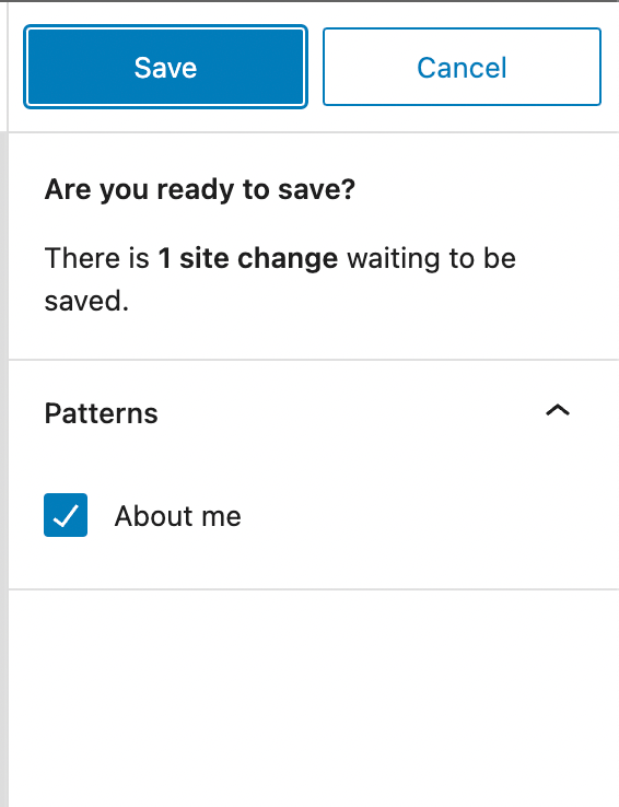
With changes potentially cascading across the site, folks want to see where things are used and what the impact might be to change something. To me, this could be a way into communicating that local vs global scenario. It’s the difference between a simple saving flow where you see changes made to a pattern vs a saving flow where you are notified of how many places are about to be updated. Here’s an example below where I’m updating a synced pattern but it’s not really clear what the impact might be:
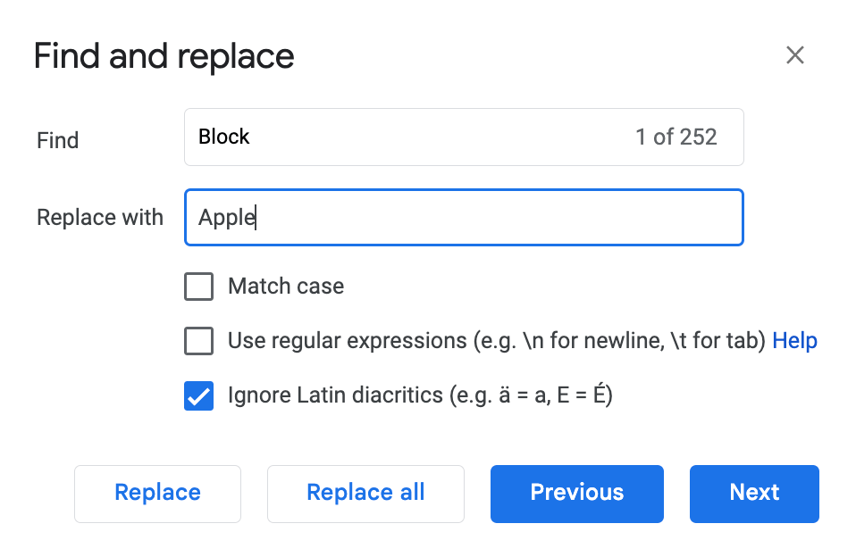
There are a fair number of related requests for more information including seeing which templates use a given template part, seeing what templates pages use in Site Editor > Pages, displaying the templates in which a navigation block is used, and seeing all instance of where a pattern is used. Going a step further, this could even be helpful with styling options to understand how many instances of something might be impacted when you change the button colors for example, similar to what you might find with search and replace:
Navigating pervasive inconsistencies
We haven’t yet gotten our icon usage right nor our what options we show at default. In talking with some folks recently about some new work coming to WordPress 6.5, one person mentioned how the “settings” icon feels out of place in the new views in the editor! Other folks agreed — they are used to seeing this settings icon next to an individual block setting rather than in the interface. As of 6.5, here are a few places where this icon is reused:

This comes up across the interface, including feedback around how the same style icon in use for global styles and styling an individual block creates confusion even as it might solve some at the same time. Let’s talk about the locking icon and how confusing using the same icon is for theme patterns in Site Editor > Patterns. This has resulted in some folks thinking that meant those patterns need to be paid for to be used! Whew.
Take another example where we use the revisions icon to represent “resetting” a template rather than displaying access to revisions. This takes two VERY different concepts and merges them into one, without so much as a confirmation modal before resetting the template:
As another example, there’s no “Add new pattern” button available when navigating in the Site Editor but there are “Add new” options for templates, template parts, and pages. This makes adding a new pattern harder to discover, despite them being powerful and likely more often used than creating a new template or template part.
When creating a new page via Pages > Add New, you get the option to select a starter pattern if your theme provides them, helping you start with some content rather than from scratch. Using the same theme, if you try to create the same exact page in the Site Editor, you won’t get access to this same starter pattern modal making it a big missed opportunity.
This too touches on what we show by default with design tool consistency, both in terms of having consistent tools available across blocks and ensuring what’s shown by default makes the most sense. This popped up when box shadow was added as a block setting, leading to confusion around what to label that section if shadow is supported but borders not and whether to have these sections separated out.
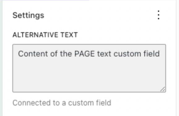
Understanding inherited values and options
There are numerous situations where we might see something inherited or provided by something else:
- A block inheriting global styles.
- A block with content provided from a custom field.
- A pattern with blocks with and without overrides.
In each of these, we’re coming up with similar solutions to show where the value is provided from, be it a global style or a custom field:

This is also going to come up as we think about “states” and “interactions” from the interactivity API. How will folks conceptualize these things in the editor and know where they can go to make changes (or when they can’t)?
Understanding what you can and can’t edit
This connects to the problems around global vs local and inherited values because in some cases something is locked and in others it needs to be edited elsewhere, like creating a page and editing the template or editing the original synced pattern to make changes. We’ve tried a few ways to get around this, including highlighting the parts you can edit, having snackbars that nudge you where you can edit what you want, and block toolbar options. In some cases, these block toolbar options are confusing though, like in the case of Edit taking you to focus mode vs Edit Original taking you into yet another focus mode that, in this case, impacts every instance of this pattern:
This also comes up with placeholders where you can’t edit the text there, despite being able to edit every other block. I’ve read feedback from folks using the Site Editor how confusing that is with folks again thinking they are purposefully being locked out in order to have to pay to upgrade in some capacity.
Making site editing your own
There are three general areas that change the experience of the Site Editor:
- Gradual adoption: adopting pieces but not the whole.
- Extension: adding in your own customizations or functionality, whether patterns or custom block styles.
- Curating: adjusting the experience to match what you need it to be, including user permissions.
This includes everything from the ease of registering templates to the experience of block locking to the ease in which you can control what folks have access to in the Site Editor. What about if you are trying to do all of the above? What’s the experience for the end user experiencing these changes? Right now, there are pieces for each of these areas in place but the experiences need to be better. For example, check out this issue about what using the site editor is like when a user is restricted from performing certain actions, like adding new templates. Here’s a GIF from that issue showing how someone just gets an unhelpful error message when trying to add a new template while in a restricted account:
Going in the other direction of extending rather than restricting, here’s an issue that details how registering patterns from pattern directory for themers needs to be improved:
- When filtering, patterns are shown as provided by the directory rather than the theme.
- Patterns that don’t match core categories are marked as uncategorized with no way to adjust that resulting in a poor experience.
- Patterns aren’t visible in the Patterns section of the Site Editor, like you’d expect with other theme patterns.
Thinking about phase 3
If you zoom out, each of these impacts phase 3 in different ways.
If you’re planning to release a new product on your website with a discount code for folks, you want to ensure that it appears in the right place. You wouldn’t want to realize later that the product page uses a different header template and the information never showed up.
If you want to collaborate with a crew of folks with different permission levels, you want it to be clear what they can edit and the impact of what they edit has, potentially even across the site.
You get the point! If more of these swirling and overlapping areas come up, I’ll update this post and leave a changelog. Even for my own sake, I want to keep track.
Changelog
February 27th: added in “Making site editing your own” section

Leave a comment